I’m not a graphic designer, but I’ve spent a great deal of my career working closely with folks who are.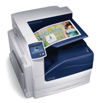
Because of that experience, plus the fact that I work for a printer technology company, I know color management is critical to those who rely on accurate prints as part of their professional lives.
And I also know how challenging it can be to print truly accurate color, i.e., the colors one sees on the screen of their workstation.
Xerox has for years been a top choice for graphic arts professionals, and the introduction of our Phaser 7800 Color Printer has bolstered our reputation in that regard.
But still, even the pros from time to time can use a little help. To that end, I found this article, courtesy of Adobe, to be quite informative.
It’s a thorough tutorial on color management best practices for those who use Photoshop Elements, which I believe covers most professional graphic designers.
I hope you find it useful.